
Making it easier to find and start a workout
After understanding why people were leaving in Chapter 1, one pattern kept surfacing: people couldn’t find what they were looking for. Before designing anything new, I stepped back to examine how content was organized and labeled.
My role: I led the information architecture audit, defined the navigation hypotheses, designed the tab bar variants, and ran usability testing. I partnered with product and engineering to ship the final navigation and validate it through an iOS A/B test.
I conducted a lightweight audit of the app’s information architecture (IA) to understand how content was grouped and how users were expected to navigate.
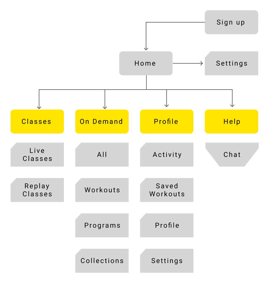
Current information architecture
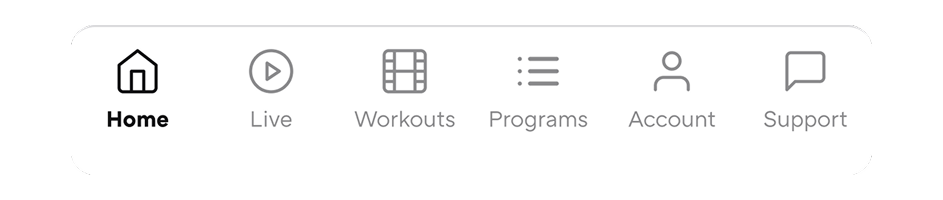
Most of the app’s content lived behind a few very broad entry points. The largest of these was On Demand. From a system perspective, this made content easier to manage. From a user’s perspective, it meant guessing. Users had to tap into sections, scan the screen, and then decide whether they were in the right place; or back out and try again. I then looked at the tab bar itself and the labels we were using.
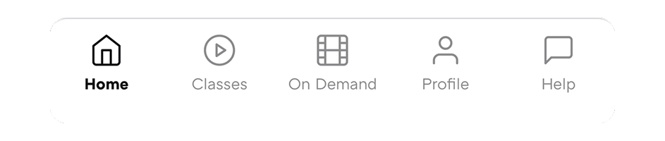
Current tap bar and labels.
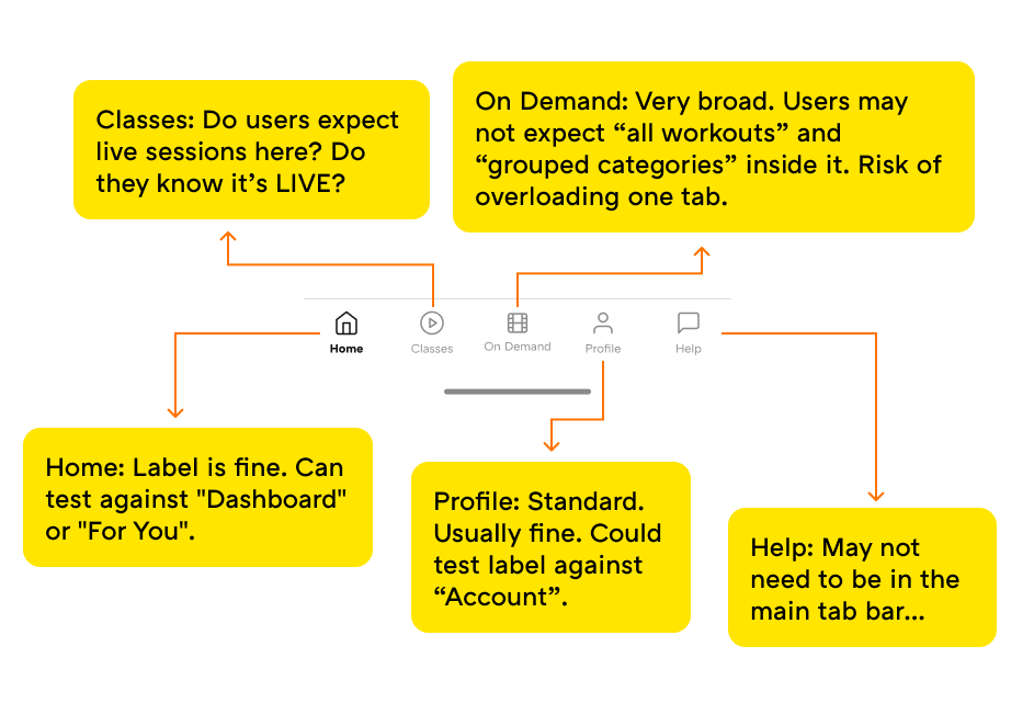
Based on this audit, I formed a few hypotheses to test. I believed “On Demand” was too vague and forced people to explore instead of decide. I also thought that live content needed to be clearly labeled as "Live", not hidden behind a generic term like “Classes”. And finally, I suspected that help and support didn’t need to live at the top level of the app to still be easy to find.
Rather than debating these ideas internally, I decided to test them with non-users.
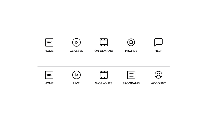
I ran a comparative usability test using Maze with 93 participants, testing three navigation variants head-to-head:
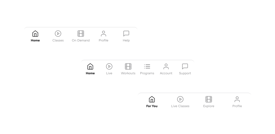
Three tab bar variants tested
Participants were given a prototype and asked to complete four tasks:
The goal was to measure not only task success, but also confidence in navigation paths, misclicks, and hesitation.
Clear, specific labels consistently outperformed broad or ambiguous ones.
Across all tasks, variants using explicit content-based labels (Live, Workouts, Programs) reduced hesitation and improved first-choice accuracy compared to abstract or overloaded labels (On Demand, Explore, For You).
V1: Current navigation (the baseline)
Users correctly associated:
The current structure technically works, but relies heavily on user guessing rather than clear decision-making.
V2: Explicit content buckets
Strong label-to-task alignment across the board:
Faster and more confident decisions than the current navigation in most tasks.
Provided the clearest mental model overall. Explicit labels significantly reduced ambiguity, even if deeper IA still needs refinement.
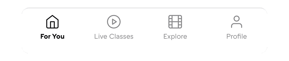
V3: Reduced tabs and conceptual labels
Reducing tabs improved simplicity, but abstract labels shifted the burden onto user interpretation, especially for first-time discovery.
Based on both testing and real user behavior, I chose the navigation that used clear, content-based labels as the foundation going forward.
We kept the structure familiar, moved Programs to its own page, moved Help inside account, and changed labels to make the meaning of each tab obvious:
To make sure this wasn’t just a usability test result, we shipped the new navigation as an A/B test on iOS.
With real users, the new navigation helped people start faster, make fewer wrong taps, and begin more workouts and programs.
This confirmed that clearer navigation wasn’t just easier to understand—it directly helped people start working out.
Even after shipping this change, there is still room to improve. I think there are smaller opportunities within the same tab navigator; like testing icon choices, label text size, and visual emphasis.
This wasn’t about making the app “look better”. It was about removing small points of friction that stopped people before they ever began. By making navigation clearer, we reduced the mental effort required to start a workout, which was exactly the problem I described in Chapter 1.
Once starting felt easier, the next problem became obvious: helping people come back again. That’s what the next chapter focuses on.