
Personalization, reminders, and building habits
Getting someone to start a workout is hard. But getting them to come back, especially after life gets busy, is a whole different challenge.
In this chapter, I focus on two features we designed to make returning to the app easier and help users build habits. One is already tested and proven to work, and the other is still being experimented with.
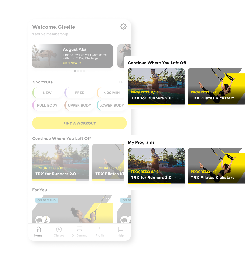
From our research, we knew people liked our programs and coaches. But once someone started a program, there was no quick way to see what workout came next when they returned to the app.
Instead of picking up where they left off, users often found themselves asking:
Because the app didn’t answer these questions clearly, many users abandoned programs, not because of low motivation, but because it was cognitively confusing to know what to do next.
These small moments of friction quietly killed motivation and often led to drop-off or unsubscribing.
I designed this feature to help users resume exactly where they stopped. It surfaces:
Instead of forcing users to search or remember, in-progress programs appear directly on the home screen. The goal was simple: reduce thinking, reduce friction, and make continuing feel effortless.
During usability testing, I focused on four key questions:
We tested “Continue Where You Left Off” against “My Programs” as the home carousel title. Both variants performed well, but “Continue Where You Left Off” removed ambiguity faster.
Task success:
Two title variants tested
Participants consistently described the section as a way to “pick up where I left off” when the title explicitly said so.
The clearer title reduced interpretation effort and helped users immediately recognize the carousel as in-progress content, not saved or new programs.
Numeric progress indicators like “8 / 13” were largely understood, but not universally.
Correct interpretation:
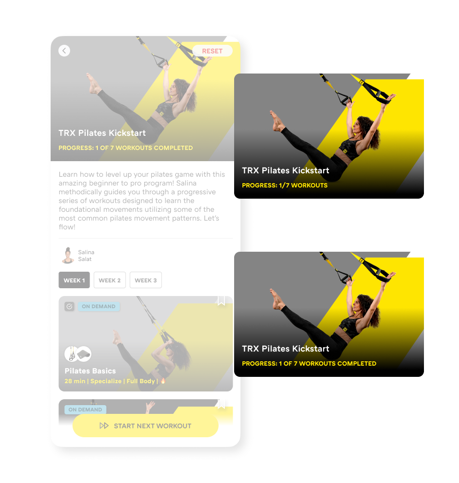
Two progress indicator variants tested
A notable minority interpreted the number as their current position in the program rather than completed progress.
Numbers alone mostly work, but pairing them with contextual cues (such as “Next workout” or completion states) helps remove lingering ambiguity and reinforces a sense of momentum.
Users had no trouble finding the “Start Next Workout” CTA in either layout, with very high completion rates.
Task success:
Expectations after tapping the CTA were clear:
This reinforced that “fast” doesn’t always mean “automatic.” Users value reassurance and context before committing, especially when returning after a break.
Resetting a program was the most sensitive interaction we tested.
Placement impact:
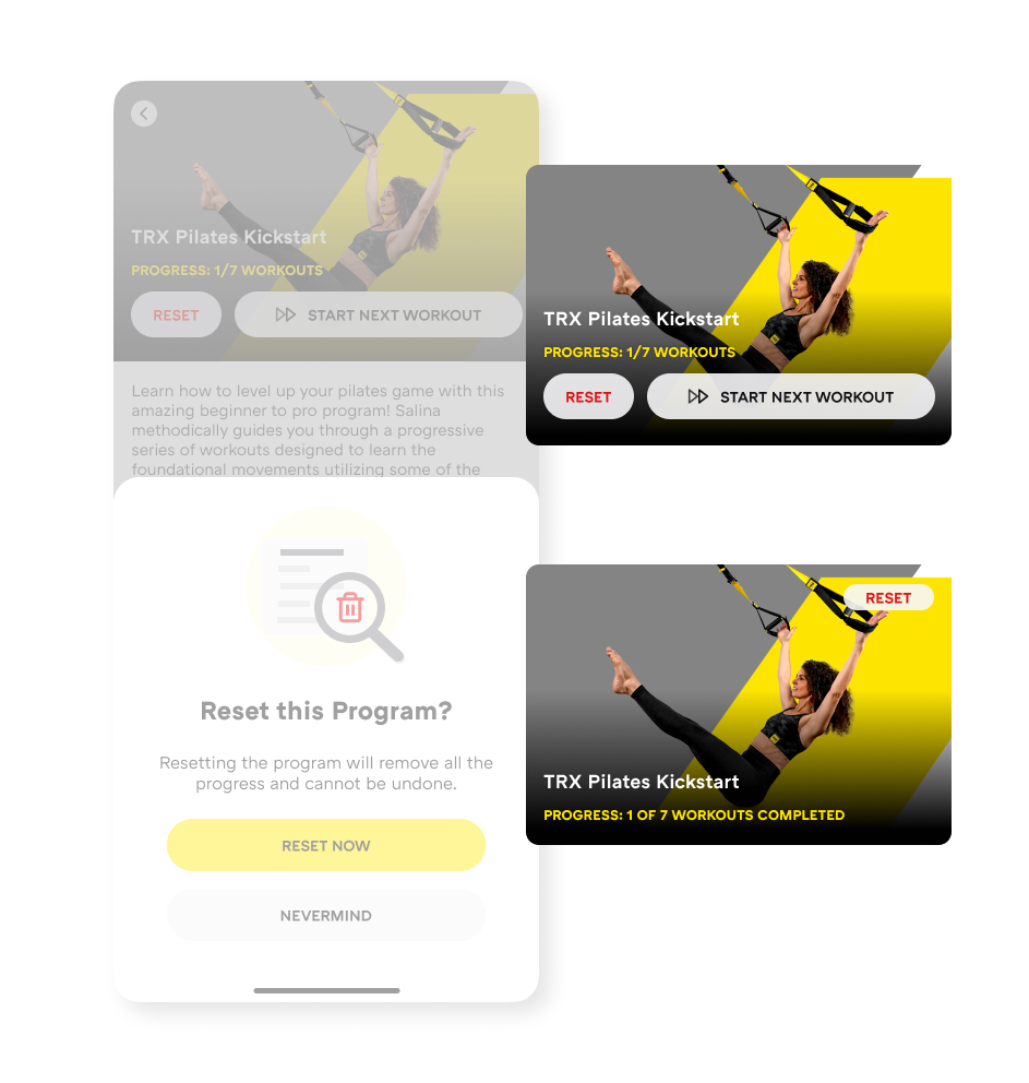
Reset button placement variants tested
Intent is real:
Resetting isn’t frequent, but it’s emotionally important. When the option is visible and clearly framed, users feel more confident starting over — without feeling like they’ve failed.
Showing progress clearly and giving users control over restarting made the app feel forgiving, supportive, and easier to return to, instead of intimidating or confusing.
While “Continue Where You Left Off” helps users return after a break, streaks focus on consistency, the gentle nudge of “Did I show up this week?”
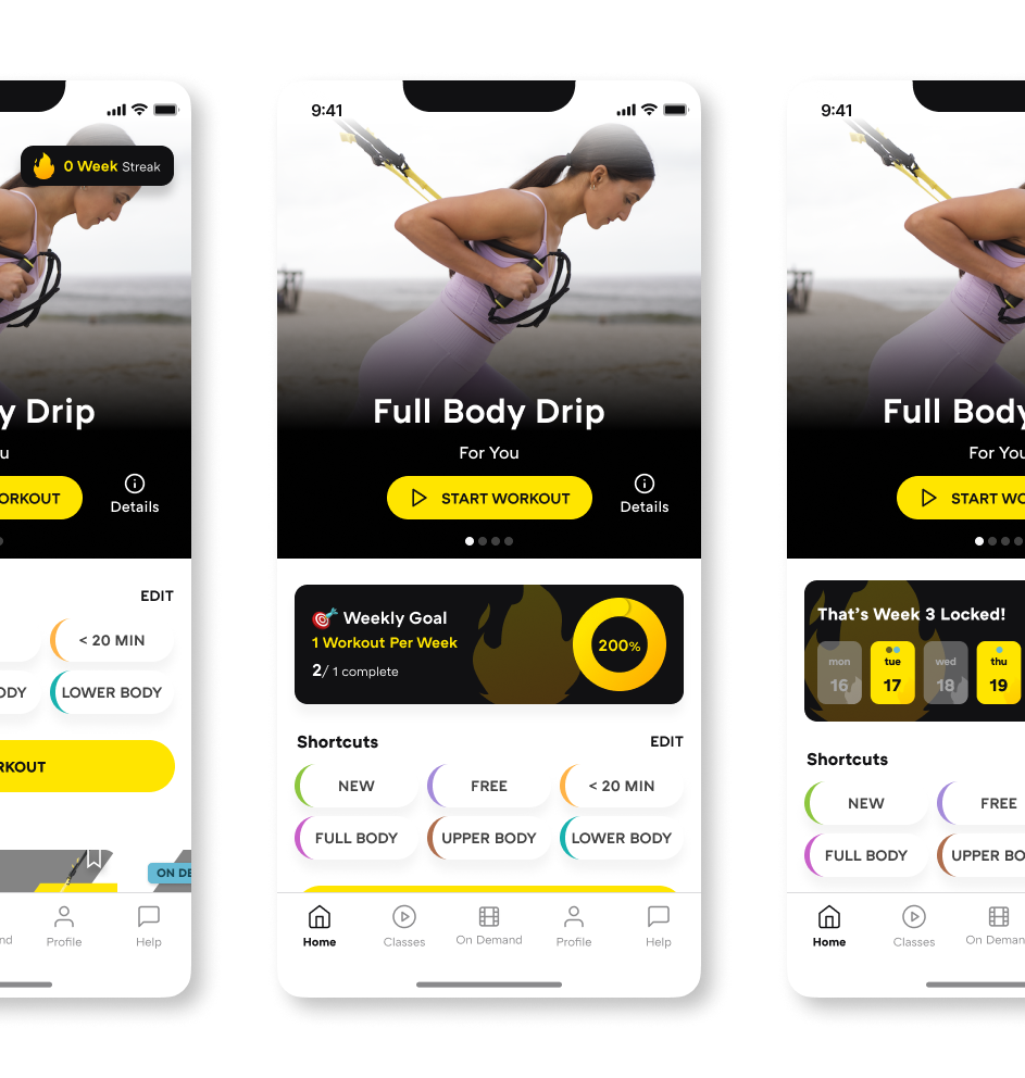
Three streak variants
We’re experimenting carefully. Poorly designed streaks can create pressure and guilt instead of motivation.
We created three streak designs plus a control with no streaks, exploring:
These experiments are currently running on iOS. Results are still pending.